A House that appears to be nothing more then a large art Sculpture
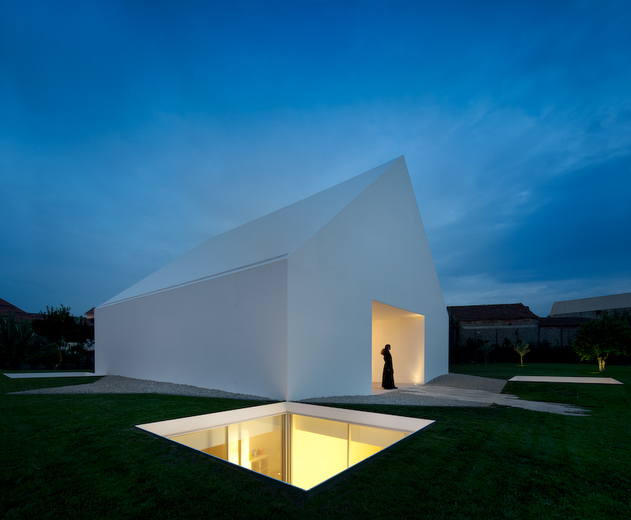
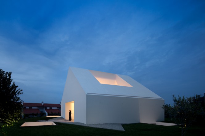
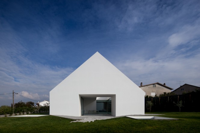
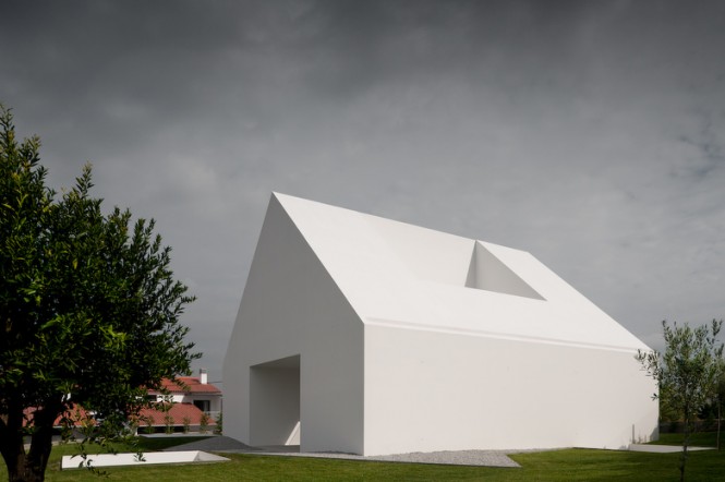
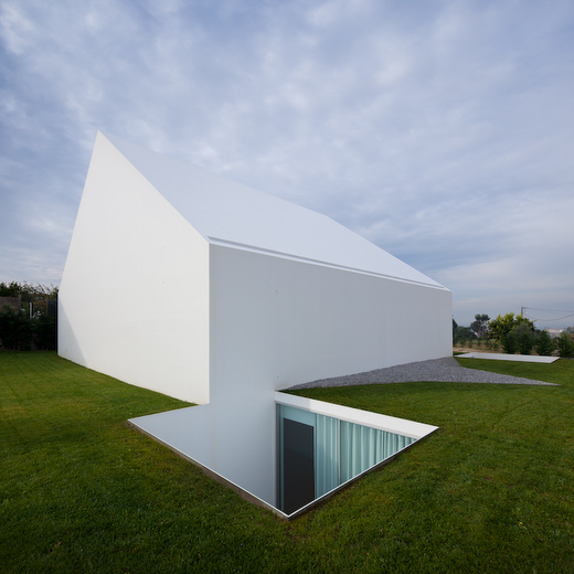
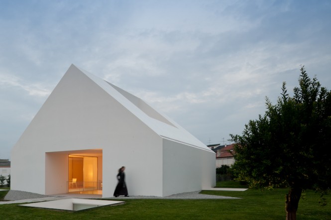
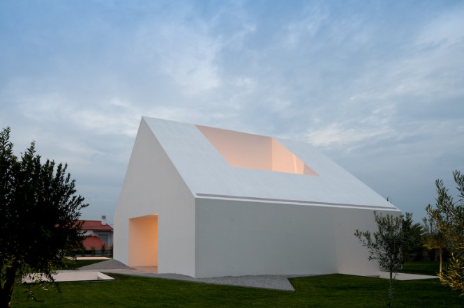
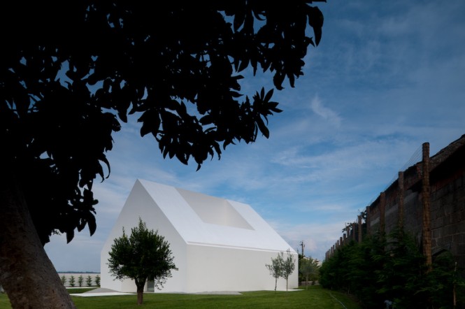
On the outskirts of Leiria, Portugal architects Manuel Aires Mateus completed a project in 2010 that truly stands on its own. What looks like at first the typical silhouette of a house soon shows it to be something else entirely.
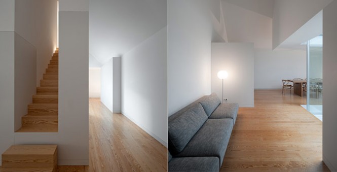
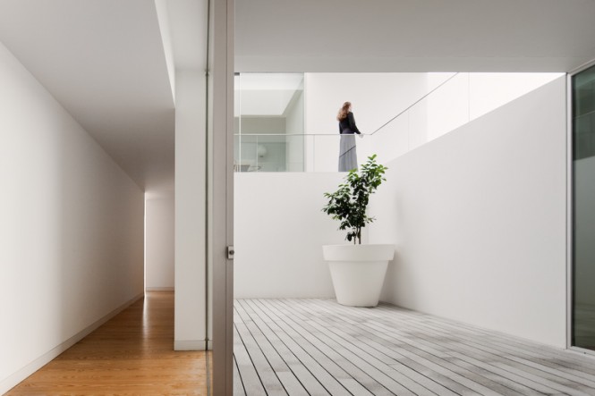
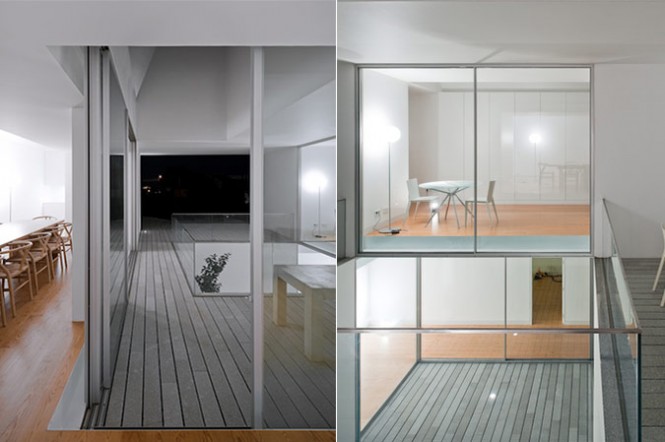
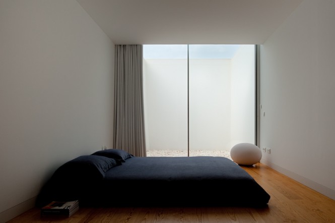
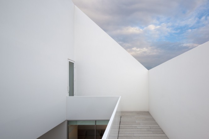
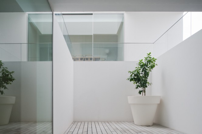
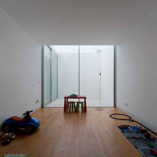
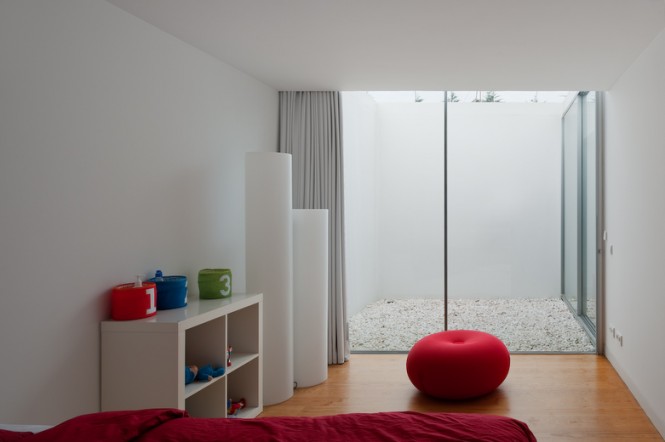
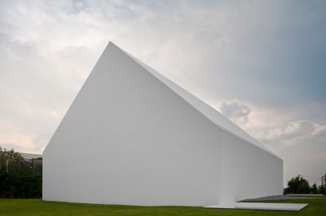
Privacy was the order of the day here as can be seen by the lack of windows and other openings. It’s stark white facade contrasts with its seemingly traditional form. The house has been designed around a three-storey central courtyard, which provides light and views for the household.
The design appears to have had a childlike beginning but this very fact shows the purity in the modern design. It is not weighed down with ornamentation of any kind. It certainly is a work of art.
Sometimes things are just not what they seem..
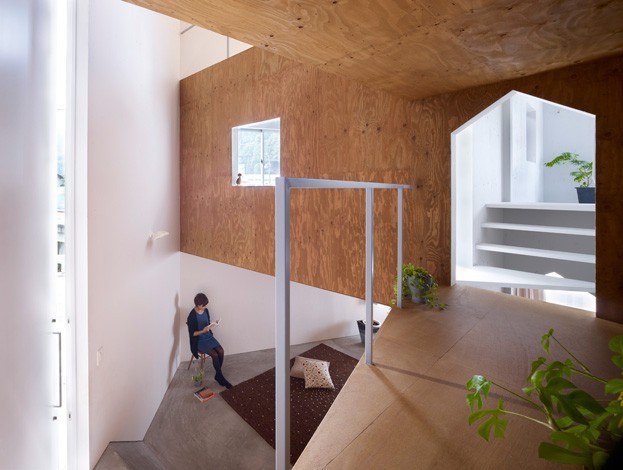
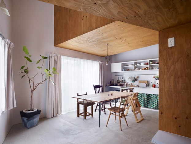
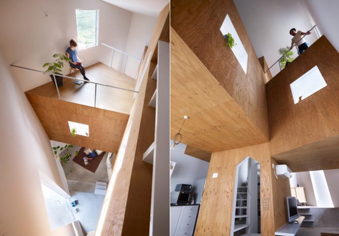
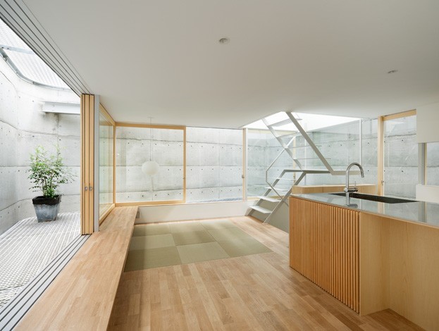
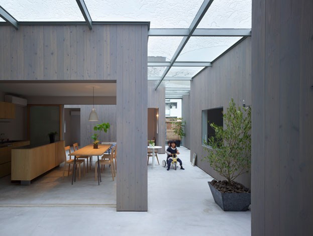
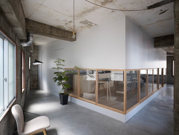
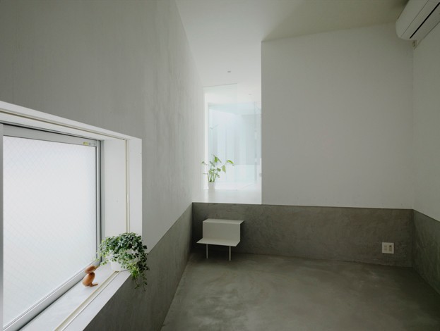
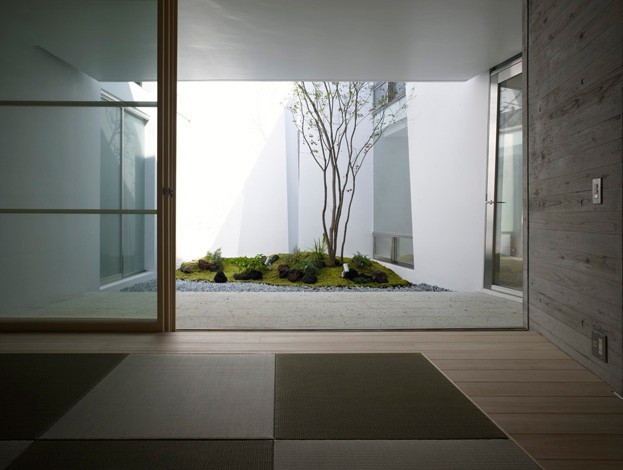
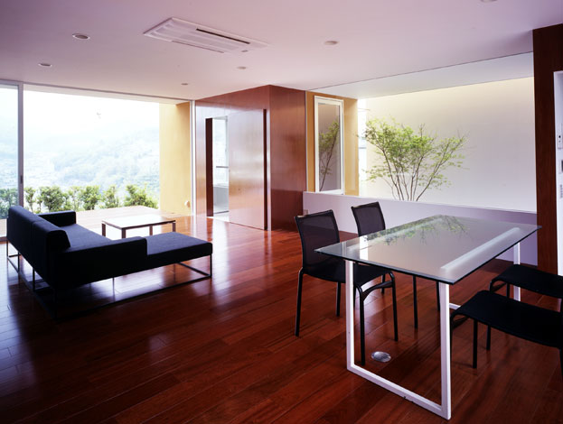
Today with modern contemporary styles being so minimal in design, many are turning to accent colors or impact single colored walls for some style eye catching impact.. In Japan one firm is using Wood, atriums to highlight the color green, or white as their primary impact colors.. It provides a very interesting outcome..
Have a look...
Interior Design with Wood, White and Green Accents
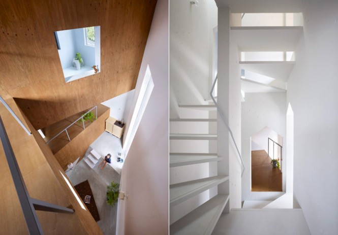
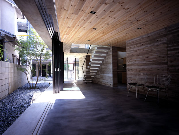
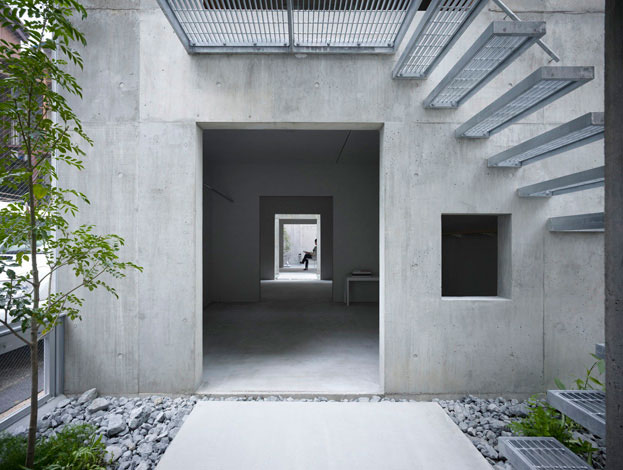
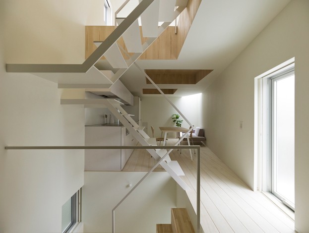
The firm of Japanese Suppose Design Studio are becoming increasingly well known for their clean simple interiors, using wood, white and plants in the finishes palette.
Their work is defined by the austerity of the design without compromising in the functionality of the space’s use. They are continually looking for something new and groundbreaking in their work and make it part of their practice to have differing perspectives developing the design.
Suppose do not believe that new for the sake of being new is the right answer. Rather they believe that new in order to better one’s way of life while still remaining familiar, is the surest way of changing the present circumstances of people’s lives.
 Interesting concepts...
AG Home Goods





No comments:
Post a Comment